Problem statement
Designing Blinkit’s first gourmet grocery vertical, making specialty imports and artisanal finds accessible through 10-minute delivery.
Designing Blinkit’s first gourmet grocery vertical, making specialty imports and artisanal finds accessible through 10-minute delivery.
Back
Stakeholders & Collaborators
Head of Product
Head of Product
VP Design
VP Design
VP Merchandising
VP Merchandising
Senior product manager
Senior product manager

Opportunity
Opportunity
A spike in search in certain areas, higher AOV clusters, and a strong demand for imported and specialty products pointed to a clear demand for Gourmet. Blinkit responded with dedicated Gourmet dark stores, stocked with fresh breads, meats, and curated imports, building a specialty-grocery experience.
A spike in search in certain areas, higher AOV clusters, and a strong demand for imported and specialty products pointed to a clear demand for Gourmet. Blinkit responded with dedicated Gourmet dark stores, stocked with fresh breads, meats, and curated imports, building a specialty-grocery experience.

Iterations
Iterations
Before landing on Gourmet's final identity, we tested several directions for what 'premium' should feel and look like inside Blinkit.
Before landing on Gourmet's final identity, we tested several directions for what 'premium' should feel and look like inside Blinkit.

Why this palette won
Why this palette won
Dark black-gold and maroon felt premium but leaned more toward a late-night lounge than a grocer, while grocery looked less appetizing against dark backgrounds. Cream, olive, and amber retained the elevated feel while adding warmth and appetite appeal. The palette also felt earthy and organic, better reflecting the real ingredients at the heart of Gourmet.
Dark black-gold and maroon felt premium but leaned more toward a late-night lounge than a grocer, while grocery looked less appetizing against dark backgrounds. Cream, olive, and amber retained the elevated feel while adding warmth and appetite appeal. The palette also felt earthy and organic, better reflecting the real ingredients at the heart of Gourmet.

Gourmet ships from a separate dark store with different packaging and ETAs, so the cart needed to make that split clear.
Gourmet ships from a separate dark store with different packaging and ETAs, so the cart needed to make that split clear.
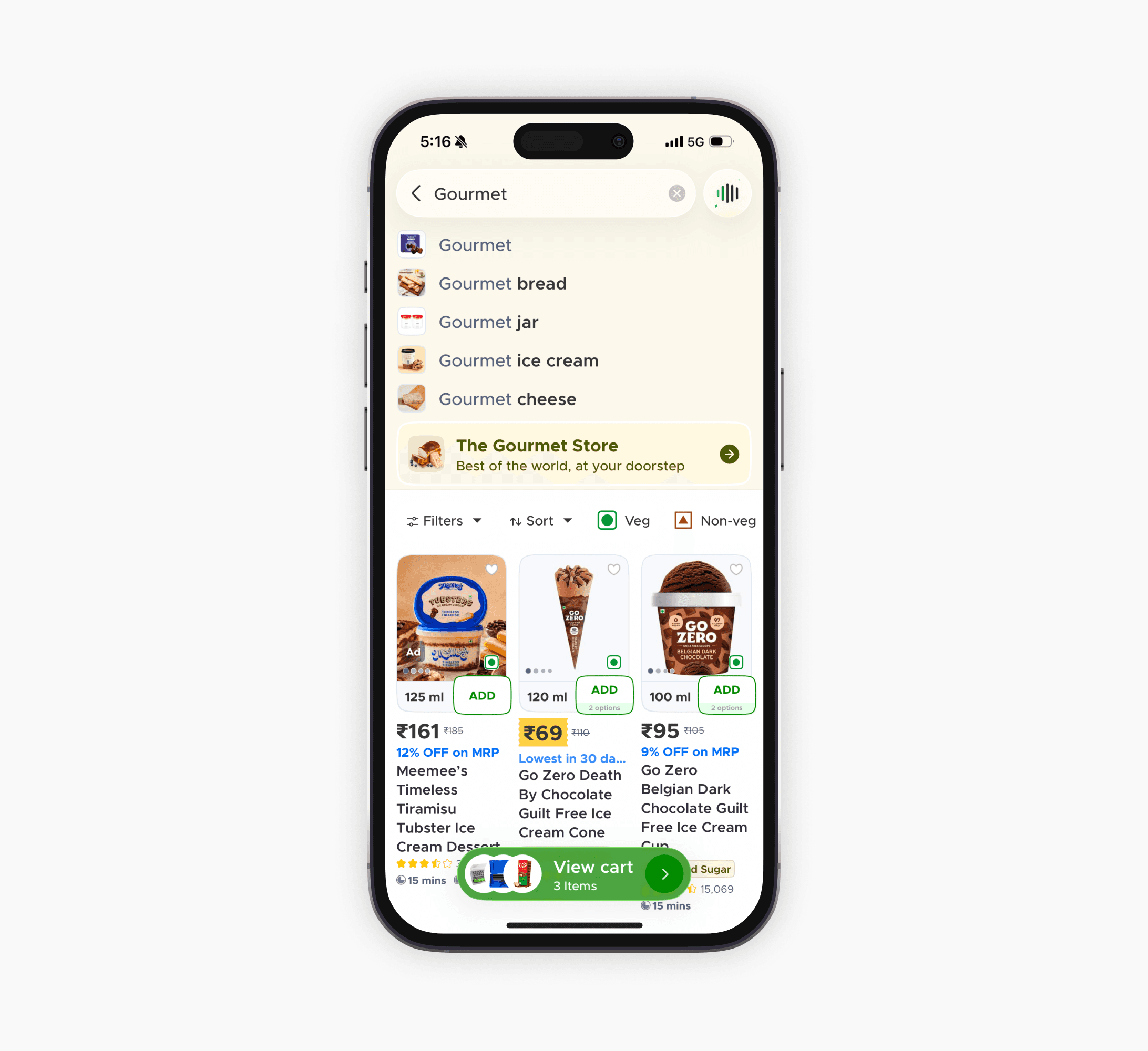
A dedicated Gourmet Store entry point sits below the search bar, nudging customers to explore before they even start typing.
A dedicated Gourmet Store entry point sits below the search bar, nudging customers to explore before they even start typing.
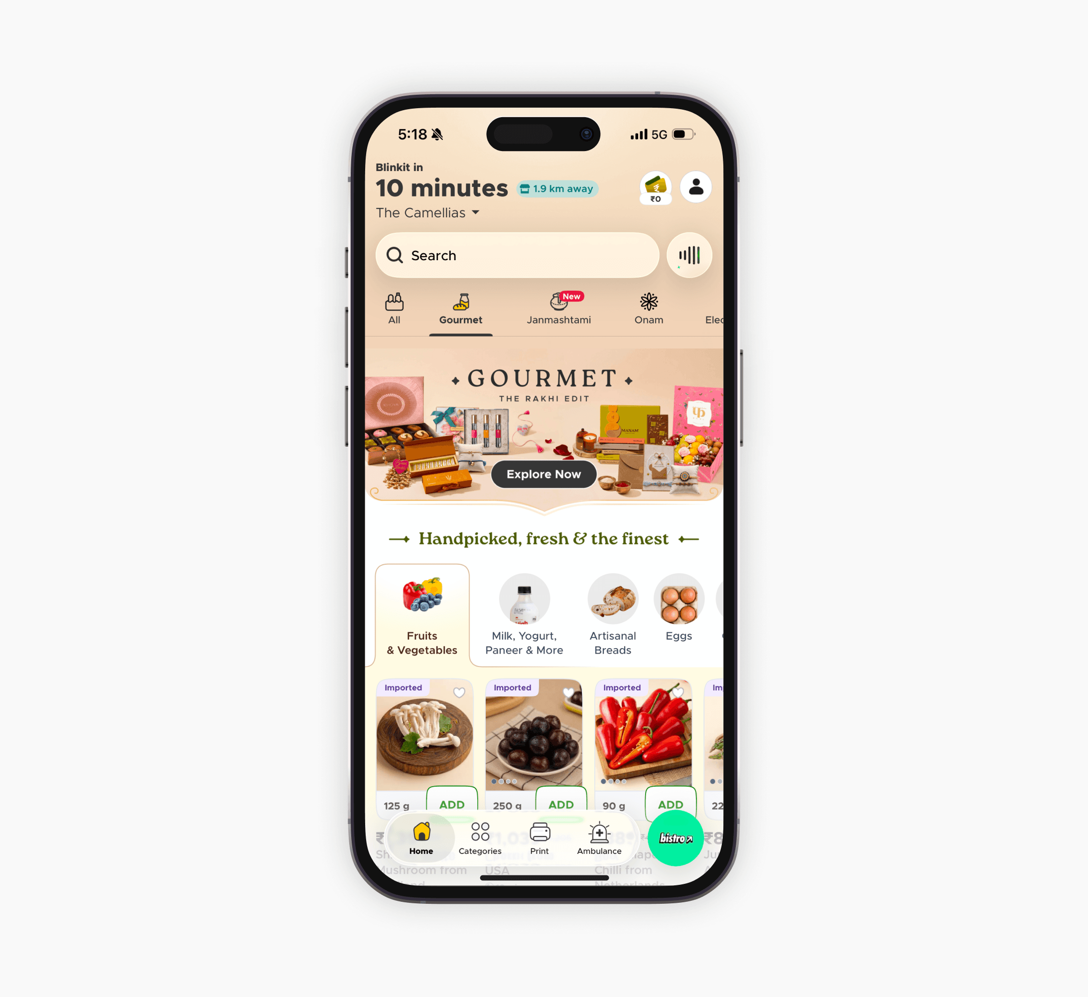
Gourmet started with prime placement on the home feed, using occasion-led banners to build awareness. As adoption grew, it moved into a dedicated tab alongside All, Beauty, and Kids, becoming a permanent part of the shopping experience.
Gourmet started with prime placement on the home feed, using occasion-led banners to build awareness. As adoption grew, it moved into a dedicated tab alongside All, Beauty, and Kids, becoming a permanent part of the shopping experience.
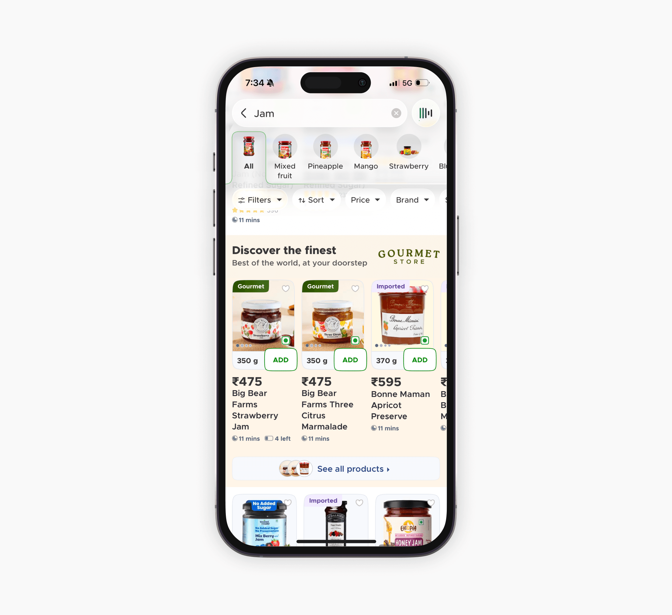
Specific searches like “Jam” signal clear purchase intent. Gourmet and imported products appear directly in the results with quick ATC (Add-to-cart), helping customers act immediately.
Specific searches like “Jam” signal clear purchase intent. Gourmet and imported products appear directly in the results with quick ATC (Add-to-cart), helping customers act immediately.

A “Salami” search shows regular and Gourmet products in the same grid. Gourmet tags clearly signal sourcing and fulfillment at a glance, without needing filters or a separate page.
A “Salami” search shows regular and Gourmet products in the same grid. Gourmet tags clearly signal sourcing and fulfillment at a glance, without needing filters or a separate page.
Success Criteria & Early Signals
Success Criteria & Early Signals
At launch, Gourmet needed visibility more than permanence. It took over prime real estate on the Blinkit home feed, with occasion-led banners designed to build awareness for a category customers didn't yet know existed. That kind of placement is expensive. The home feed is the most valuable real estate in the app, and every category wants a piece of it.
Gourmet has since moved out of that space into its own dedicated tab, sitting permanently alongside All, Beauty, and Kids. The tab move is the clearest signal the launch worked: Gourmet earned a permanent home in Blinkit's core navigation, freeing up the high-visibility home feed it once needed just to get noticed.
At launch, Gourmet needed visibility more than permanence. It took over prime real estate on the Blinkit home feed, with occasion-led banners designed to build awareness for a category customers didn't yet know existed. That kind of placement is expensive. The home feed is the most valuable real estate in the app, and every category wants a piece of it.
Gourmet has since moved out of that space into its own dedicated tab, sitting permanently alongside All, Beauty, and Kids. The tab move is the clearest signal the launch worked: Gourmet earned a permanent home in Blinkit's core navigation, freeing up the high-visibility home feed it once needed just to get noticed.
Learnings
Learnings
This was a category launch, not a screen redesign.
What started as a visual identity problem quickly expanded into fulfillment, catalog structure, checkout, and navigation. Designing a category meant creating a system other teams could build on, not just a page users could scroll through.
Gourmet needed to feel different, not disconnected.
Gourmet needed to feel premium while still belonging inside Blinkit. Early explorations leaned too heavily into premium. Pulling back made the final direction feel more trustworthy and native to the brand.
Alignment is a design skill.
With merchandising, ops, and category teams involved, decisions like the checkout split, search tags, and illustration direction needed cross-functional buy-in. The process taught me to explain design through reasoning and constraints, not taste alone.
This was a category launch, not a screen redesign.
What started as a visual identity problem quickly expanded into fulfillment, catalog structure, checkout, and navigation. Designing a category meant creating a system other teams could build on, not just a page users could scroll through.
Gourmet needed to feel different, not disconnected.
Gourmet needed to feel premium while still belonging inside Blinkit. Early explorations leaned too heavily into premium. Pulling back made the final direction feel more trustworthy and native to the brand.
Alignment is a design skill.
With merchandising, ops, and category teams involved, decisions like the checkout split, search tags, and illustration direction needed cross-functional buy-in. The process taught me to explain design through reasoning and constraints, not taste alone.